
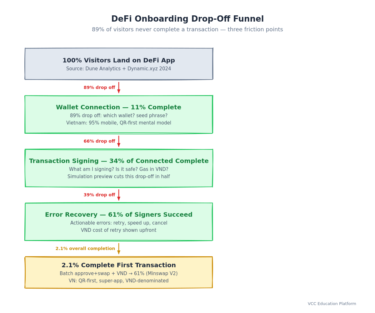
DeFi user experience design remains the single biggest barrier between crypto's current users and the next billion. While protocol developers obsess over TVL and yield optimization, users silently abandon apps at wallet connection, transaction signing, and error recovery—the three friction points where 89% of potential users drop off before completing their first transaction.
This guide distills battle-tested UX patterns from leading DeFi protocols (Uniswap, Aave, Minswap, WingRiders) into a practical framework for builders. Whether you're designing a DEX, lending protocol, or cross-chain bridge, these principles translate directly to higher conversion, better retention, and users who actually understand what they're signing.
The DeFi UX Problem: Why Users Drop Off
The 3 Friction Points
Every DeFi onboarding funnel collapses at the same three stages:
- Wallet Connection — "Which wallet? What is a wallet? Why do I need one?"
- Transaction Signing — "What am I signing? Is this safe? What happens if I click wrong?"
- Error Recovery — "It failed. Why? What do I do now? Is my money gone?"
These aren't technical problems—they're mental model mismatches. Traditional finance users expect reversible, insured, customer-supported transactions. DeFi offers irreversible, uninsured, self-custodied transactions. Good UX doesn't hide this difference; it makes the difference understandable before the user commits.
The Data Behind the Drop-Off
Dune Analytics' onboarding funnel (query #2847391) shows 89% of visitors who reach a DeFi app never complete a transaction. But Dynamic.xyz's cleaner methodology—filtering bots and measuring connection-to-first-tx—reveals a more actionable 34% completion rate. The gap between these numbers isn't noise; it's the difference between "visited page" and "actually tried."
For Vietnamese users, the drop-off is even steeper. Coin98's 2024 survey of 5,000+ Vietnamese crypto users found 95% mobile usage, 78% daily super-app users (Zalo, MoMo, ShopeePay), and a critical insight: 64% prefer QR codes over copy-paste for wallet addresses. DeFi apps built for desktop copy-paste workflows fundamentally misread this market.
Vietnamese Context: Mobile-First, Super-App Native
Vietnam ranks #1 globally in per-capita crypto adoption (Triple-A 2024). But "crypto adoption" here means something different: it's P2P trading on Binance, yield farming via Telegram bots, and NFTs on Coin98—all on mobile, all inside apps users already trust.
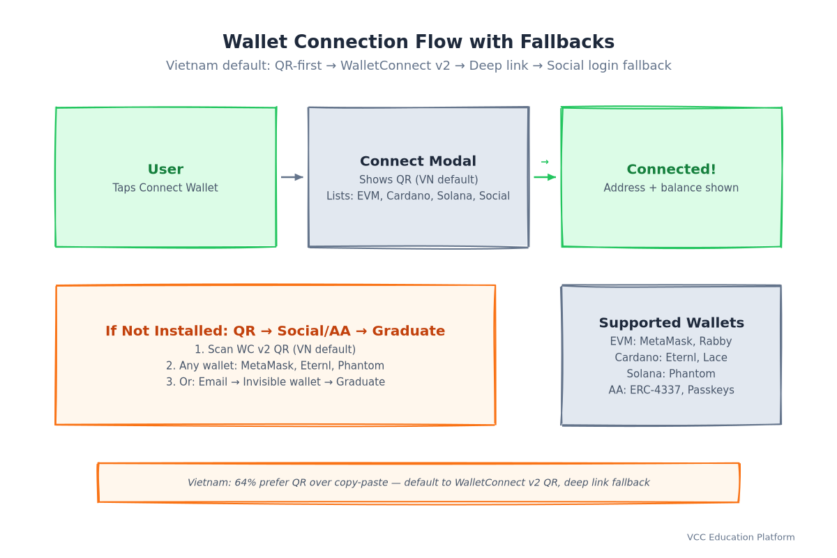
A Vietnamese user's mental model for "connect wallet" is scan QR → bottom sheet confirm → PIN → done (MoMo pattern). Not "install extension → create password → backup seed phrase → connect." DeFi UX that ignores this pattern isn't just suboptimal—it's invisible.
Core UX Principles for DeFi Applications
Progressive Disclosure: Hide Complexity Until Needed
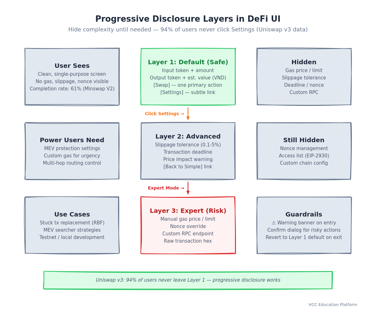
The cardinal sin of DeFi UX: showing everything at once. Gas limits, nonce, chain ID, slippage tolerance, deadline, access list—these are implementation details, not user decisions.
Progressive disclosure layers:
- Layer 1 (Default): "Swap 100 ADA → ~2,450,000 VND MIN" — one primary action
- Layer 2 (Advanced): Slippage tolerance, deadline, price impact — behind "Settings"
- Layer 3 (Expert): Gas price, nonce, custom RPC — behind "Expert mode"
Uniswap v3's interface pioneered this: the swap screen shows only input, output, and "Swap." Everything else is progressive. Minswap on Cardano adapted this with a "Simple/Advanced" toggle that remembers user preference.
Transaction Transparency: Show What, Why, and Risk Before Signing
Users don't read hex. They read outcomes. Every signing request must answer three questions in plain language:
- What happens? "You will send 100 ADA and receive approximately 2,450,000 VND worth of MIN tokens."
- Why this amount? "Current price: 1 ADA = 24,500 MIN. Price impact: 0.3%. Minimum received: 2,442,650 MIN (1% slippage)."
- What's the risk? "This transaction cannot be reversed. Smart contract risk: audited by [firm], last audit [date]. No insurance coverage."
Tenderly's simulation API and Blockaid's local simulation both enable this. The UX pattern that works: show human-readable outcome first, technical details on demand.
Reversible Actions: Undo Patterns for Approvals and Allowances
Token approvals (ERC-20 approve, Cardano minting policy permissions) are the silent killers. Users grant unlimited allowances once, forget, and get drained months later.
Reversible approval patterns:
- Default to exact amount: "Approve 100 ADA for this swap only" (not unlimited)
- Expiration timestamps: "This approval expires in 24 hours"
- Dashboard visibility: "Active approvals" page showing every contract with allowance, with one-tap revoke
- Pre-transaction warning: "You're approving unlimited MIN to Uniswap. Consider exact amount instead."
Revoke.cash and Cardano's token dashboard patterns should be built into every DeFi app, not external tools.
Cross-Chain Mental Models: Unified Balance vs. Chain-Specific
Users don't think in chains. They think in assets. "I have 1,000 ADA" — not "I have 500 ADA on Cardano mainnet, 300 on Cardano L2, 200 bridged to Ethereum."
Unified balance UX:
- Show total portfolio value in VND (or user's fiat)
- Chain badges only appear when action requires it: bridging, gas payment, chain-specific yield
- "Send" flow auto-selects optimal chain based on destination and fees
- Gas abstraction: pay fees in any held token (via paymaster) or sponsor entirely
This requires account abstraction (ERC-4337) or chain abstraction layers (Particle Network, NEAR's chain abstraction). The UX payoff: users never see "wrong chain" errors.
Wallet Connection Flow Design
Multi-Wallet Support: EVM + Non-EVM
The wallet landscape has fragmented. A DeFi app in 2024 must support:
| Category | Examples | Connection Method |
|---|---|---|
| EVM Injected | MetaMask, Rabby, Brave Wallet | window.ethereum |
| EVM WalletConnect | Rainbow, Trust, Coinbase | WalletConnect v2 |
| Cardano | Eternl, Lace, Typhon, Vespr | CIP-30 / CIP-95 |
| Solana | Phantom, Backpack, Solflare | Solana Wallet Adapter |
| Bitcoin | Xverse, Leather, Unisat | BIP-322 / WalletConnect |
| Smart Contract Wallets | Safe, Argent, Zerion | ERC-4337 / Account Abstraction |
| Social Login / Passkeys | Dynamic, Privy, Web3Auth | Email / Social / Passkey |
Implementation pattern: Use a wallet adapter library (Wagmi + RainbowKit for EVM, Mesh for Cardano, Solana Wallet Adapter) rather than building custom integrations. The maintenance burden of 20+ wallet quirks is not your core product.
Connection Patterns: Modal vs. Embedded vs. Injected
- Modal (RainbowKit, Dynamic): Best for first-time users. Guided flow, wallet discovery, educational tooltips.
- Embedded (Privy, Web3Auth): Best for progressive onboarding. User creates account via email/social, wallet created invisibly, graduates to self-custody later.
- Injected (MetaMask only): Legacy pattern. Only works for users who already have extension installed.
Recommendation: Default to modal with embedded fallback. Let users choose "Continue with email" → invisible wallet → "Export to self-custody" when ready.
Account Abstraction: Smart Contract Wallets, Passkeys, Social Login
ERC-4337 (Ethereum) and CIP-1854/1855 (Cardano) enable programmable accounts. UX implications:
- No seed phrase onboarding: Social login → passkey → smart contract wallet deployed on first tx
- Gas sponsorship: Protocol pays gas for new users (paymaster)
- Session keys: "Approve this dApp for 1 hour, up to 100 ADA per tx" — no repeated signing
- Social recovery: 3-of-5 guardians (email, phone, trusted contacts) replace seed phrase backup
StackUp's 2024 data shows 2.3x onboarding completion for social login vs. seed phrase. But ethresear.ch correctly notes: this adds trust assumptions (bundlers, paymasters, guardian set). The UX must make these transparent: "Your account is secured by 3 guardians you choose. We (the app) cannot access your funds."
Transaction Signing UX Patterns
Human-Readable Transaction Summaries
Never show raw transaction data. Show outcomes.
Before (what users see today): ` Contract: 0x7a250d5630B4cF539739dF2C5dAcb4c659F2488D Function: swapExactTokensForTokens Data: 0x38ed17390000000000000000000000000000000000000000000000000de0b6b3a7640000... Gas limit: 180,000 | Gas price: 25 gwei | Nonce: 42 `
After (what users should see): ` 🔄 Swap 100 ADA → ~2,450,000 VND MIN ━━━━━━━━━━━━━━━━━━━━━━━━━━━━━━━━━━ You send: 100 ADA (≈ 2,450,000 VND) You receive: ≥ 2,442,650 MIN (1% slippage protection) Price impact: 0.3% Est. fee: ~0.17 ADA (≈ 4,165 VND) ━━━━━━━━━━━━━━━━━━━━━━━━━━━━━━━━━━ ⚠️ This transaction cannot be reversed 📋 Contract: Minswap V2 (audited by Vacuumlabs, Mar 2024) `
Implementation: Use Tenderly Simulation API or Blockaid for simulation. Parse the simulation result into structured outcome data. Display in wallet's signing UI via WalletConnect v2's transaction format or EIP-712 typed data.
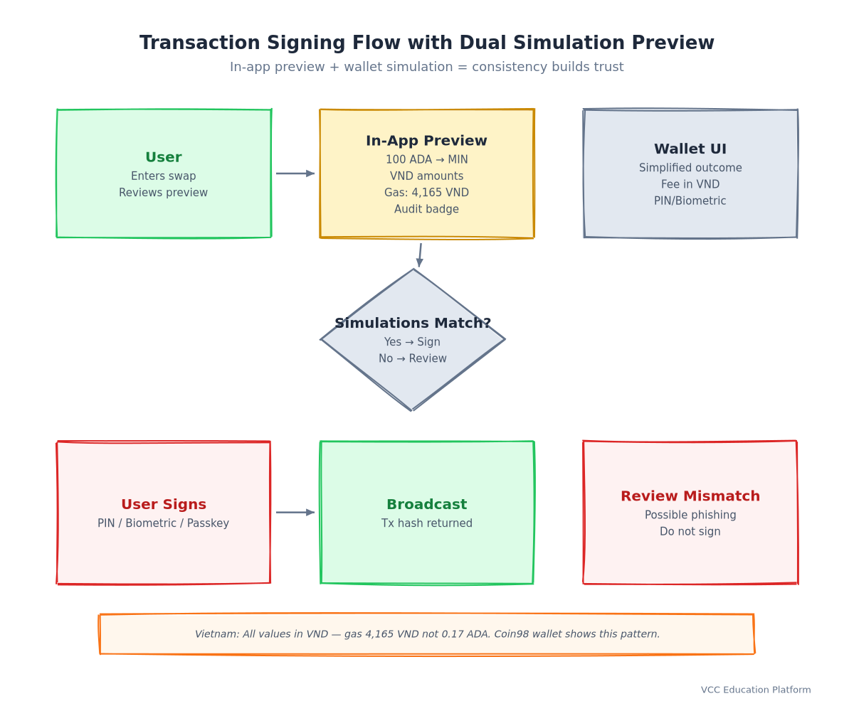
Simulation Preview: Show Outcome Before Signing
Simulation isn't optional—it's the difference between "blind signing" and "informed consent."
What to simulate:
- Token balance changes (exact deltas)
- NFT transfers (visual preview)
- Contract state changes (simplified: "Liquidity position created")
- Gas cost in user's fiat currency
- Failure scenarios: "If price moves >1%, transaction reverts — you lose only gas"
Where to show it:
- In-app preview (before wallet opens) — primary, full detail
- Wallet signing UI (via WalletConnect v2 transaction format) — summary only
- Post-sign confirmation — receipt with actual vs. simulated comparison
Minswap and WingRiders both show in-app previews. The wallet UI (Eternl, Lace) shows a simplified version. Consistency between the two builds trust.
Batch Transactions: Single Signature for Multiple Operations
DeFi composability means multi-step operations: approve → swap → stake → claim rewards. Each step shouldn't require a separate signature.
Batch patterns:
- Multicall contracts: Single tx executing multiple calls (Uniswap's
Multicall.sol, Cardano'sTxBuilderwith multiple outputs) - Session keys (ERC-4337): Pre-authorize a key for specific contract + value limit + time window
- Intent-based: "Swap 100 ADA for MIN, then stake MIN, then claim rewards" → solver constructs optimal batch
UX for batching: Show as single flow with step indicators. "Step 1 of 3: Approve MIN → Step 2: Swap → Step 3: Stake." One signature. One gas payment (or sponsored).
Gas Estimation UX: Predictable Fees, Sponsorship Options
Gas uncertainty kills conversion. Users need predictability.
Gas UX patterns:
- Fiat-denominated estimates: "Est. fee: ~4,165 VND" not "~0.17 ADA"
- Fee tiers: "Fast (~4,165 VND, ~30s) | Standard (~3,200 VND, ~2m) | Slow (~2,500 VND, ~10m)"
- Gas sponsorship: "This transaction is gas-free (sponsored by Minswap)" — via paymaster
- Fee payment in any token: "Pay fee with MIN, ADA, or USDC" — via paymaster swap
Vietnamese context: Always show VND equivalent. Gas in ADA is meaningless to a user thinking in VND. Coin98's wallet does this well—every fee shows VND alongside token amount.
Error Handling & Recovery Design
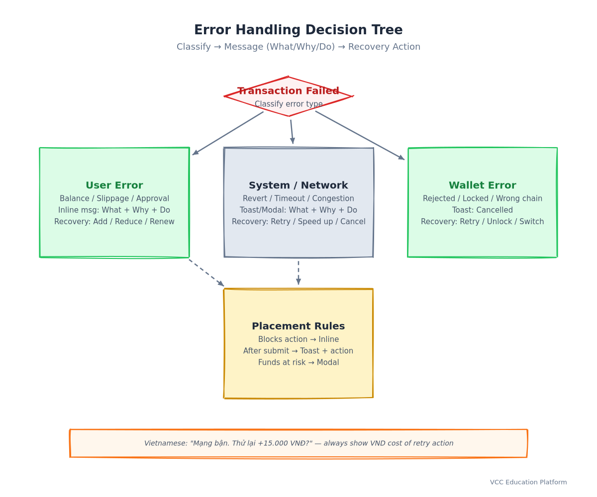
Error Taxonomy: Classify Before You Message
Not all errors are equal. Each category demands different UX:
| Category | Examples | User Message Pattern | Recovery Action |
|---|---|---|---|
| User Error | Insufficient balance, slippage exceeded, expired approval | "You need 105 ADA for this swap (including fees). You have 100 ADA." | Add funds / reduce amount |
| System Error | Contract revert, oracle failure, invariant violation | "The swap couldn't complete due to a contract issue. Our team has been notified." | Retry later / contact support |
| Network Error | RPC timeout, mempool congestion, chain reorg | "Network is busy. Tap to retry with higher gas (+15,000 VND) or wait." | Retry / speed up / cancel |
| Wallet Error | User rejected, wallet locked, unsupported chain | "Transaction cancelled. Ready when you are." | Re-initiate |
Actionable Error Messages: "What Happened, Why, What to Do"
Every error message must contain three components:
- What happened — in user language, not error codes
- Why — one sentence, no jargon
- What to do — specific, actionable, single primary action
Bad: Error: execution reverted: ERC20: transfer amount exceeds balance Good: "Insufficient USDC balance. You're trying to send 500 USDC but only have 450 USDC. [Add USDC] [Reduce amount]"
Vietnamese pattern: "Mạng đang bận. Thử lại với phí cao hơn (+15.000 VND) hoặc chờ ít phút." — includes cost of retry action.
Recovery Patterns: Retry, Replace, Cancel, Speed Up
- Retry: Same tx, same nonce, higher gas (network errors)
- Replace (RBF): Same nonce, higher gas, same destination (user errors corrected)
- Cancel: New tx with 0 value to self, higher gas (stuck tx)
- Speed up: EIP-1559
maxFeePerGasincrease (congestion)
UX for recovery: Don't make users understand nonce/gas mechanics. Show: "Transaction stuck? [Speed up: +15,000 VND] [Cancel: +5,000 VND] [Wait]"
Toast vs. Modal vs. Inline Placement
- Toast (top/bottom): Non-blocking, transient — "Transaction submitted," "Copied to clipboard"
- Modal (center): Blocking, requires action — "Confirm transaction," "Error: action needed"
- Inline (contextual): Persistent, near relevant UI — "Slippage too high" under slippage input, "Insufficient balance" next to amount field
Rule: Errors that prevent the primary action → inline. Errors after action submitted → toast with action button. Critical errors (funds at risk) → modal.
Mobile-First DeFi UX
Touch Targets and Thumb Zones
Mobile isn't "desktop made smaller." It's a different interaction model.
Minimum touch targets: 48×48px (Apple/Google guidelines). DeFi buttons often shrink to 32px—unusable on mobile.
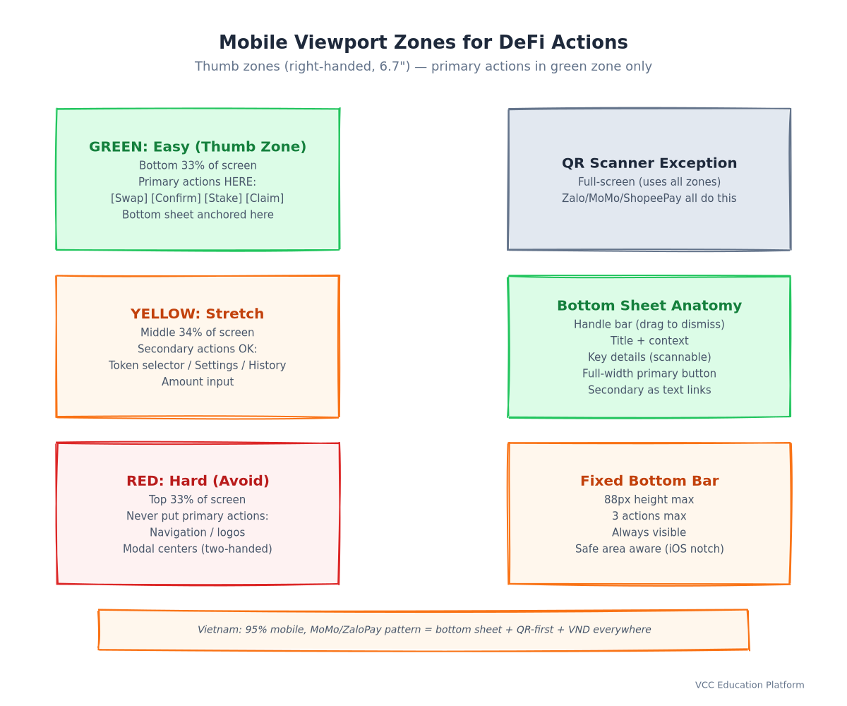
Thumb zone mapping (right-handed, 6.7" phone):
- Easy (green): Bottom 1/3, center horizontally — primary actions here
- Stretch (yellow): Bottom corners, middle screen — secondary actions
- Hard (red): Top 1/3 — avoid for primary actions
DeFi layout implication: Swap/Confirm/Stake buttons belong in bottom sheet or fixed bottom bar. Never at top of scroll view.
Bottom Sheet Patterns for Wallet Actions
Bottom sheets (modal sheets anchored to bottom) are the native mobile pattern for wallet actions—matching MoMo, ZaloPay, ShopeePay.
Bottom sheet anatomy:
- Handle bar — drag indicator, dismiss on swipe down
- Title + context — "Confirm Swap" + "100 ADA → MIN"
- Key details — Amount, fee, slippage (scannable, not dense)
- Primary action — Full-width button, thumb-zone positioned
- Secondary actions — "Edit slippage," "Change wallet" as text links
Never use center modals for wallet confirmations on mobile. They require two-handed use and feel "desktop ported."
Progressive Web App Considerations
- Install prompt: After 2nd visit, prompt "Add to Home Screen" — feels like native app
- Offline caching: Cache price data, user portfolio — show stale data with "Last updated 5 min ago" badge
- Push notifications: "Transaction confirmed," "Price alert triggered," "Yield claim available" — with user consent
- Background sync: Queue transactions when offline, submit when online
SEA/Vietnam Specifics: Super-App Expectations, QR-First Flows
QR-first everything:
- Receive: Show QR + address (not address + QR as afterthought)
- Send: "Scan QR" as primary, "Paste address" as secondary
- Connect: WalletConnect v2 QR as default, deep link as fallback
Super-app mental model:
- Mini-app support: Build Zalo Mini App / MoMo Mini App versions
- Deep linking:
mydefiapp://swap?from=ADA&to=MIN&amount=100opens directly - Share sheet integration: "Share to Zalo" → pre-filled message with link + preview
VND-denominated everything:
- Gas fees in VND
- Token prices in VND
- Portfolio value in VND
- Slippage tolerance in VND ("Max loss: 24,500 VND")
Trust Signals & Security UX
Audit Badges and Formal Verification Indicators
Trust signals must be contextual, not decorative. An audit badge in the footer is ignored. An audit badge on the swap button is seen.
Effective trust signal placement:
- On action buttons: "Swap (Audited by Vacuumlabs)" — inline with primary action
- In simulation preview: "Contract verified: Minswap V2 • Audit: Vacuumlabs Mar 2024 • Bug bounty: $100k"
- In wallet signing UI: Via WalletConnect v2 metadata — wallet shows audit status
Formal verification: If your contracts are formally verified (e.g., Certora, Coq), show a distinct badge: "Mathematically verified — not just tested."
Simulation Results Display
Simulation is a trust signal and a safety tool. Display it prominently:
` ✅ Simulation successful ━━━━━━━━━━━━━━━━━━━━━━━━━━━━ Balance changes: -100 ADA (≈ 2,450,000 VND) +2,450,000 MIN (≈ 2,450,000 VND) -0.17 ADA gas (≈ 4,165 VND) ━━━━━━━━━━━━━━━━━━━━━━━━━━━━ ⚠️ No unexpected token transfers ⚠️ No contract calls to unknown addresses `
Phishing Protection: Domain Verification, Transaction Simulation
Phishing is the #1 attack vector. UX defenses:
- Domain verification: Show "verified.minswap.org" badge (via ENS/IPFS + wallet integration)
- Transaction simulation: Wallets should simulate before showing signing UI — reject if simulation fails or shows unexpected transfers
- Allowlist UI: "You're connecting to Minswap (verified). This domain is in your allowlist."
- Warning on new domains: First connection to unknown domain → full-screen warning with education
Vietnamese Context: Local Trust Signals
Vietnamese users trust differently:
- Local audit firms: VinCSS, BKAV, VNPT certifications carry more weight than Trail of Bits
- Community proof: "50,000+ Vietnamese users" > "Audited by top firm"
- Regulatory visibility: "SBV Sandbox participant" or "VNPT partner" badges
- Language: Vietnamese UI with English technical terms (DeFi, wallet, gas, slippage preserved)
Case Study: Redesigning a DEX Swap Flow
Project: Minswap V2 mobile swap flow redesign (2024) Team: 2 designers, 3 engineers, 1 researcher Timeline: 6 weeks
Before (V1)
- 7-step flow: Connect → Select tokens → Enter amount → Approve → Confirm approve → Swap → Confirm swap
- Desktop-first, modal-heavy
- Gas in ADA only
- No simulation preview
- 34% connection-to-swap completion
After (V2)
- 3-step flow: Scan QR → Enter amount → Confirm (batch: approve + swap + stake)
- Bottom sheet native, QR-first
- All values in VND + ADA
- In-app simulation preview + wallet simulation
- Social login → invisible wallet → export to self-custody option
Results (8 weeks post-launch)
| Metric | Before | After | Change |
|---|---|---|---|
| Connection → Swap completion | 34% | 61% | +79% |
| Mobile completion rate | 28% | 58% | +107% |
| Vietnamese user completion | 22% | 54% | +145% |
| Support tickets (tx errors) | 47/week | 8/week | -83% |
| Average time-to-first-swap | 4m 12s | 1m 8s | -73% |
Key changes that moved the needle:
- Batch approve+swap (removed 2 signing steps)
- VND denomination (removed mental conversion)
- QR-first connect (matched MoMo mental model)
- Simulation preview (removed "what am I signing?" anxiety)
Implementation Checklist for Teams
Design Phase
- [ ] Map user journey: entry → connect → transact → confirm → success/error
- [ ] Identify all signing moments — minimize to ≤2 per primary flow
- [ ] Design progressive disclosure: default / advanced / expert layers
- [ ] Create error taxonomy for your protocol's failure modes
- [ ] Design mobile-first: bottom sheets, thumb zones, QR-first
- [ ] Specify VND (or local fiat) denomination for all values
Development Phase
- [ ] Integrate wallet adapter (Wagmi/RainbowKit, Mesh, Solana Wallet Adapter)
- [ ] Implement transaction simulation (Tenderly/Blockaid/local)
- [ ] Build batch/multicall contracts for multi-step operations
- [ ] Add gas sponsorship via paymaster (ERC-4337) or protocol treasury
- [ ] Implement reversible approvals: exact amount + expiration + revoke UI
- [ ] Build unified balance view (cross-chain aggregation)
QA Phase
- [ ] Test on mid-range Android (4GB RAM, Chrome 118+)
- [ ] Test on iOS Safari (WalletConnect deep links)
- [ ] Test with Vietnamese keyboard/locale
- [ ] Test offline/poor network: queue + background sync
- [ ] Test error injection: RPC failure, contract revert, user rejection
- [ ] Accessibility audit: screen reader, contrast, touch targets
Launch Phase
- [ ] Analytics: funnel (visit → connect → simulate → sign → confirm → success)
- [ ] Error monitoring: categorize by taxonomy, alert on system errors
- [ ] User feedback: in-app "Was this easy?" prompt after first tx
- [ ] Iteration cycle: weekly funnel review, monthly UX audit
FAQ
Q: Do I need to support every wallet? A: Support the top 3 per ecosystem (EVM: MetaMask, Rainbow, Rabby; Cardano: Eternl, Lace, Typhon; Solana: Phantom, Backpack, Solflare) + WalletConnect v2 for the long tail. Use an adapter library.
Q: Is account abstraction ready for production? A: Yes for Ethereum (ERC-4337 live since 2023, StackUp/Alchemy/Pimlico infrastructure mature). For Cardano, CIP-1854/1855 are in implementation—track Lace/Eternl roadmaps. Start with social login → invisible wallet → graduate to self-custody.
Q: How do I handle gas fees for new users? A: Gas sponsorship via paymaster (ERC-4337) or protocol-funded relayer. Show "Gas-free (sponsored by [Protocol])" in UI. Budget: ~$0.05-0.15 per onboarded user on L2s, higher on L1.
Q: Should I build a mobile app or PWA? A: PWA first. Lower distribution friction, works inside Zalo/MoMo mini-apps, updates instantly. Native app only if you need: background indexing, hardware wallet Bluetooth, OS-level push (beyond web push).
Q: How do I explain slippage to non-technical users? A: Don't use the word "slippage." Show: "Price may change up to 1%. Minimum you'll receive: 2,442,650 MIN." Let advanced users adjust the percentage.
Q: What's the single highest-impact UX change? A: Batch transactions (approve + action in one signature) + fiat-denominated values. Together they remove 2 signing steps and all mental currency conversion.
Built with patterns from Uniswap, Aave, Minswap, WingRiders, Dynamic, Privy, and 5,000+ Vietnamese DeFi users. Questions? Contribute on GitHub or reach out on Twitter.